
Sierra Coffee Packaging Re-brand
The Assignment:
To create new packs and labels for an established local coffee brand.
Challenges:
-
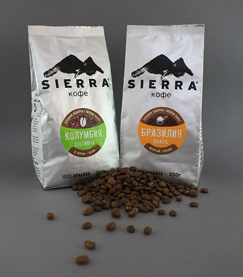
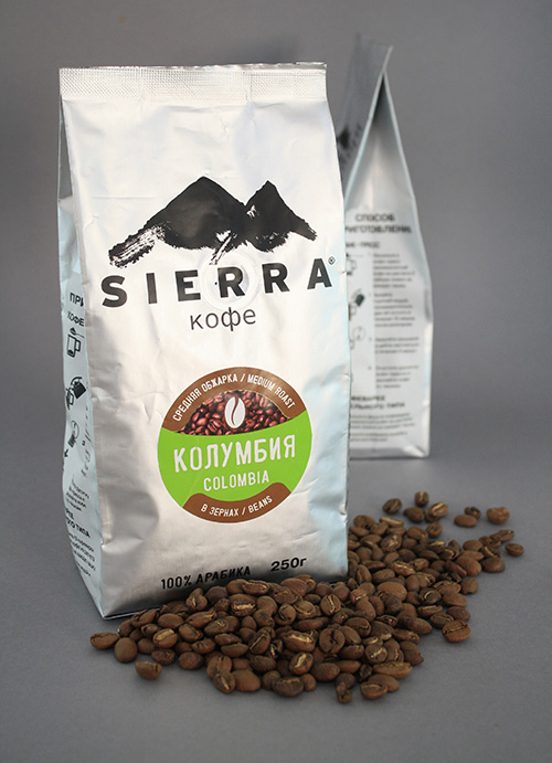
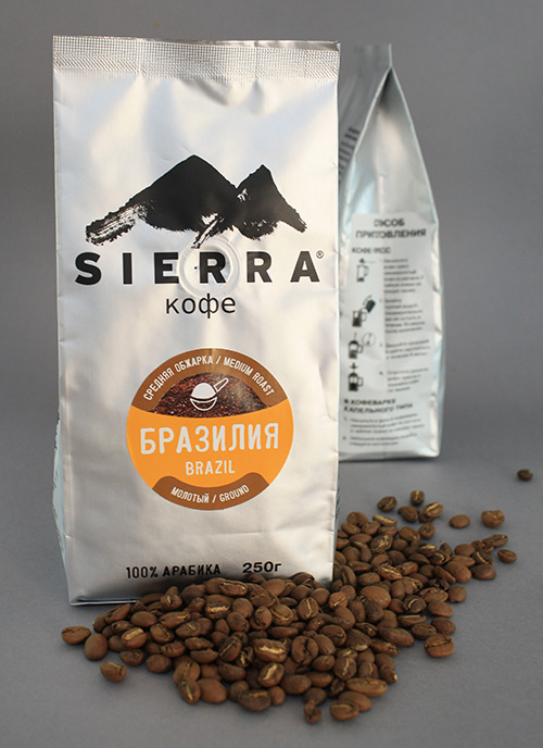
Working with expectations– Coffee is something quite new to the region and is considered a luxury item by most. Early on all coffee packs in the region were black, including Sierra’s. The challenge was to break out of this rut, while still giving customers a product that looked classy.
-
Languages – between the locals, expats and tourists that frequent the coffee house they need to have everything in 2-3 languages – which quickly adds up to a lot of words on a small label.
Solution:
We chose silver packs which had the logo and all the information common to all the packs printed right on it. This allowed us to keep the label very simple. With the help of colours and simple icons, customers can now quickly and easily distinguish between the different grinds, roasts, and origins of the coffee.
Sierra Projects:

Packaging:
No Results Found
The page you requested could not be found. Try refining your search, or use the navigation above to locate the post.